I love The Simpsons. It is a series that is on its 26th season and over 26 seasons it is easy to assume that maybe, possibly, some of the characters are not quite as sophisticated as Homer and are based on ethnic stereotypes. Although stereotypes are common on television and
generally take on a negative connotation, they can be used to establish
tone, mood, atmosphere, or familiarity with a subject. I will not cover redeeming characteristics because although racial and
ethnic stereotypes abound, many of the characters are three dimensional
beings who are not merely caricatures.
I will start with the most obvious: Apu Nahasapeemapetilon. At a glance, Apu is a stereotypical convenience store who works days-long shifts (because he loves it so much), has 8 kids (alluding to India's population), had an arranged marriage, and has a PhD in engineering. Furthermore, Apu's accent and trademark phrase, "thank you, come again" are some of his most noticeable characteristics but he is voiced by Hank Azaria who is clearly a Jewish man from New York. The series has also explored other well-known Indian stereotypes such as the accursed technical call center wherein people named "Steve" and "Jack" attempt to help us Westerners with our problems.
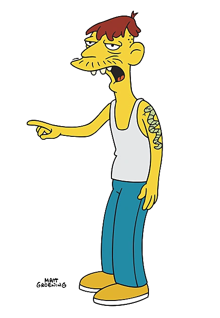
Cletus Spuckler, most commonly known as "Cletus the slack-jawed yokel" embodies the stereotype of Southern Americans with his thick accent, lack of education, and many children. Cletus is an extreme example of Southern hillbillies whereas Richard O'Hara, better known as The Rich Texan, is a stereotype of gun-toting Texans. Richard plays off of the stereotype that Texans love guns, wears a stetson hat and cowboy boots, and speaks with a Texan accent. Furthermore, he is known for firing his revolvers in the air and yelling "yee-haw!" at the top of his lungs.
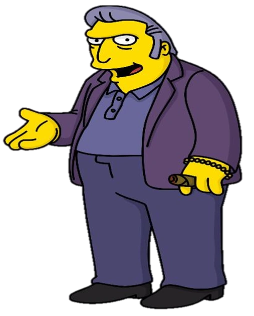
Other ethnic stereotypes encountered include a few Italians, mainly Fat Tony and his gang, and Luigi. In Tony's case, he embodies the Italian mobster stereotype. His speech roughly mimics that of Marlon Brando's Vito Corleone and Luigi, an Italian immigrant and owner of a restaurant speaks with a stereotypical Italian accent and phrases.
Monday, March 16, 2015
Saturday, March 14, 2015
Post 9 (or, my feelings on advertising)
Advertising,
in all of its forms, can be intrusive if executed poorly or it can be
clever if executed well. While I struggle to define my stance on
advertising I feel it best to explore the spectrum of emotions and
reactions to advertising both in individual examples and as a whole.
I
do not mind advertising as long as it is not intrusive. For instance,
electronic billboards are, in my opinion, an eyesore. Besides some
examples being poorly designed (which I will touch on later), I find
them distracting and sometimes even painful to look at. I do not mind
ads in magazines as long as they are not mixed with articles since I
can simply flip the page and not have to look at it but
advertisements on the internet are perhaps what I loathe most in the
world. Pop-up ads, spam ads, ads embedded in news articles which are
sometimes difficult to distinguish from the article itself, noisy ads
– these are the bane of my existence.
I use
Adblock when I browse the internet to subdue all advertisements
because ads on the internet are so intrusive. They interfere with the
browsing experience and tend to be extremely unimaginitive. I am, of
course, referring to ads which read “Drivers in California don't
know this one simple trick” or some such clickbait nonsense. I feel
most ads on the internet are misleading and harmful to personal
computers and thus should be eliminated but the money involved means
that will not become a reality. I feel I am completely justified
using browser add-ons such as Adblock because internet advertisements
are intrusive and, well, everybody hates pop-ups.
Post 8 (or, an exploration of racism in advertising)
I would like to an explore an older ad for the purpose of this post, and by "older ad" I mean an advertisement that is only 9 years old so it is still fairly recent and caused quite a stir at the time. I am, of course, referring to Sony's PSP White billboard which was put up in Amsterdam that advertises... the PSP.

So is the media attention
One of the interesting aspects of this ad has to do with the location in which it was displayed. This particular picture is from Amsterdam and the campaign was designed for the entirely of The Netherlands. What makes this important is the perception of race and race relations around the globe. In the United States, the ad is seen as the domination of a black person at the hands of a white person - the semiotic analysis gives us that quite clearly - but it is due to race relations in the U.S. that we picked up on the racial aspect of the ad. Some journalists have argued that the ad would never have flown in the U.S. and thus was created for the European market because slavery and segregation are still fairly recent in our nation's history. The argument, therefore, implies that the racial aspect would not be picked up in Europe. Let's ignore the fact that many European nations were involved in the slave trade; it was not solely the domain of the United States where most slaves were brought.
One may argue that the nature of the product (a special white colored variation of the standard black handheld gaming system) means that the advertisements will play up the color difference as a way to entice customers. However, products that come in variable colors have skirted the race issue by focusing solely on the products and by avoiding connections between the colors and race.
Tuesday, March 3, 2015
Post 7 (or, a closer look at digital media and environmental campaigns)
Greenpeace's "Unfriend Coal" campaign began in January 2010 amidst rumors that Facebook was going to build a coal-powered data center in Oregon. Greenpeace launched the campaign in February of that year in order to spread persuade Facebook to use renewable energy instead and thus pages were created on Facebook in multiple languages with titles such as "we want Facebook to run on 100% renewable energy." By July 2010, nearly half a million Facebook users had urged the company to stay away from coal power. This was followed up with letters written directly to Mark Zuckerberg's Facebook inbox. Television commercials, some which featured celebrity endorsements, were aired in California.
The campaign eventually spread globally with notable activity in Sweden, Uganda, Senegal, and even set a Facebook record for the most comments on a single Facebook post in 24 hours with the total being over 80,000. Over a span of 20 months, Facebook relented to public pressure and decided to invest in renewable energy instead, marking a clear victory for both users and non-users alike.
Source
Monday, March 2, 2015
Post 6 (or, thoughts on a sexist ad)
Of the three ads to choose from, I find the Alcoa Aluminum ad fascinating. It captures the 1950s aesthetic perfectly: from the hair style and colors to -- especially -- the sexist attitude. One could argue that the ad is a product (pun totally intended) of the time. Women were expected to stay home and tend to household duties. Women were expected to be mothers, predominantly, and to provide the family with food.
That said, the ad furthers the mindset of the era by portraying the woman as the keeper of the home and relegates her to household duties. Worse, the ad portrays women (if we extrapolate gender stereotypes from the image) as physically weak. The company practically boasts that no matter how weak a woman is, she will be able to open the bottle because the product is just that good.
That said, the ad furthers the mindset of the era by portraying the woman as the keeper of the home and relegates her to household duties. Worse, the ad portrays women (if we extrapolate gender stereotypes from the image) as physically weak. The company practically boasts that no matter how weak a woman is, she will be able to open the bottle because the product is just that good.
Friday, February 27, 2015
Post 5 (or, an exploration of gender stereotypes)
Gender stereotypes may possibly be most visible in advertisements for cleaning products and food items, especially restaurants. Fast food restaurants such as Carl's Jr. predominantly employ attractive, skinny, white women in their campaigns. A quick Google search of "Carl's Jr. Ads" brings up pages and pages of images of women in bikinis eating Carl's Jr. burgers. The disconnect is obvious: why are these women, dressed as they are, eating burgers in sexual postures? Obviously the ads are working because sex sells but they are effective because they reduce women to being sexual objects juxtaposed with a product.
On the household side, ads for appliances or cleaning products generally tend to depict women who desire to purchase them so that they can clean and maintain the home. For instance, this Bosch appliances advertisement shows the evolution of their appliances between the years 1886 and 2011. What is interesting is that instead of showing a male in the most recent ads, the company decided to show women standing next to their appliances which reinforces the notion that women were responsible for household chores in the 1880s and still are today.
On the household side, ads for appliances or cleaning products generally tend to depict women who desire to purchase them so that they can clean and maintain the home. For instance, this Bosch appliances advertisement shows the evolution of their appliances between the years 1886 and 2011. What is interesting is that instead of showing a male in the most recent ads, the company decided to show women standing next to their appliances which reinforces the notion that women were responsible for household chores in the 1880s and still are today.
Thursday, February 26, 2015
Post 4 (or, the issue of stereotypes in advertising)
Is it ever right to racially stereotype for advertising purposes?
Simply, no. If you have to resort to stereotypes to sell your product you need a new advertising agency or a better product. By using race or stereotypes as a platform to sell an item I think it reduces the credibility of the product being sold and undermines its quality.
Is racism in advertising a thing of the past?
Clearly it is not. Recent advertisements -- some of which we have seen in class -- clearly demonstrate that racism in advertisement is prevalent. For instance, this recent Ralph Lauren advertisement used images of Native Americans dressed in RL clothes. The cultural insensitivity of taking photos of Native Americans whose people faced genocide and prejudice and applying them to fashion is appalling and undermines the attitudes of Americans during the time the photos were taken.
Celine Cooper writes:
"Native American children were forcibly sent to boarding schools and prohibited from speaking their own languages. Traditional practices were forbidden. Many government policies of assimilation were enforced through threats of violence and imprisonment."
Do advertisers have ethical responsibilities?
I would say so. Mass media messages are being sent out to people in all corners of the country and the world so it would be asinine to assume that anything could be broadcast without repercussion. Advertisers have the ability to persuade the pubic and shape culture and thus should be aware of the implications in their messages.
Tuesday, February 17, 2015
Post 3 (or, I'm doing a semiotic analysis of 3 ads)
TV Commercial:
Denotation:
Print Ad:
Heinz Plant Bottle:
Denotation:
Outdoor Ad:
IBM, Smarter Cities
Denotation:
- Rob Lowe is seated in a studio and introduces himself, explaining that he has DirecTV.
- He is holding a cup of coffee and wearing a suit. He is clean shaven and sports a clean haircut.
- Then "Super Creepy Rob Lowe" walks into the frame and introduces himself and tells the audience that he has cable.
- Super Creepy Rob Lowe is dressed in a leather jacket, has a bit of a gut, and is wearing jeans. He has a mustache and slicked back hair.
- Super Creepy Rob Lowe then caresses normal Rob Lowe's shoulder.
- In the next scene, Rob Lowe is sitting in bed watching TV and explaining DirecTV's reliability.
- Cut to Super Creepy Rob Lowe and he is sitting poolside at a public rec center. He explains that his cable is out and so he resorts to watching people swim.
- Cut back to normal Rob Lowe still in bed but this time sipping a warm drink.
- Next, cut to Creepy Rob Lowe in a movie theater telling the TV audience that he loves the smell of people's hair as he sniffs the hair of the woman in front of him.
- The next cut zooms out and portrays Rob Lowe standing in his suit next to his creepy counterpart and he implores the audience to not be creepy and get DirecTV instead.
- The last image on the screen is the pricing, contract, and customer service information
- Rob Lowe's initial appearance in his suit indicates a classy individual, perhaps a professional
- The studio background is used as a means to trick the audience into believing that this commercial is meta, or not a typical commercial.
- Creepy Rob Lowe's dress and mannerisms are indicative of an individual you may not want to meet. He is more laid back than the suited up Rob Lowe.
- When Super Creepy Rob Lowe caresses Rob Lowe's shoulder, the message being conveyed is that those who have cable are creeps or perverts; dress poorly, and are generally people you don't want to meet whereas DirecTV viewers are sophisticated, in shape, handsome, and dress well.
Print Ad:
Heinz Plant Bottle:
Denotation:
- Red bottle facing viewer, has sticker with company name, black text, plant bottle logo, weight information
- Bottle has a white cap on the bottom
- A green tomato vine is connected to the bottle cap
- Ad copy to the right of the bottle with supplemental information in the bottom right
- Plant bottle logo and recycling information
- logo of tomato on vine in bottom right which reads "grown not made"
- White background
- The red bottle replaces a tomato on a vine to imply that it is natural
- It involved word play with the copy, "plant one on every table" by connecting the bottle to the tomato plant
- This also implies that not only is the bottle 'natural' or 'organic' in a sense but also that the ketchup is made from natural tomatoes
- The bottle is meant to be recycled and is made of recycled material
Outdoor Ad:
IBM, Smarter Cities
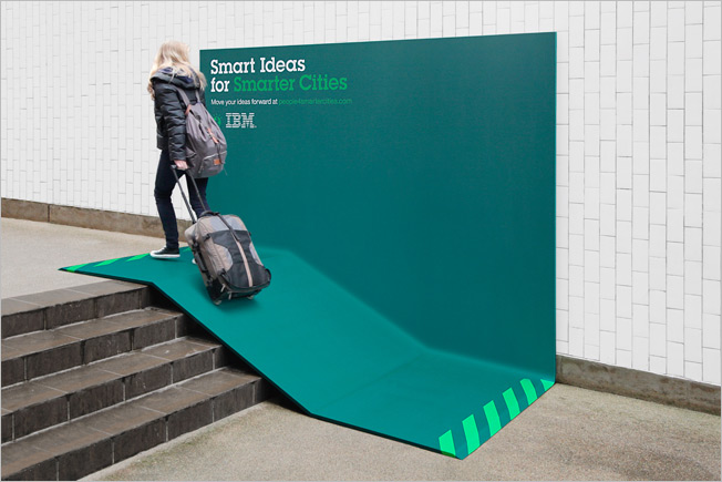
Denotation:
- Concrete steps in the foreground
- Woman wearing gray backpack, black jacket and dark blue jeans
- She is hauling a gray and black suitcase
- She is walking up a green/blue ramp that has been placed over a portion of the steps
- The ramp has a vertical wall portion which rests against the building
- The words "Smart Ideas for" in white at the top left corner of the vertical portion
- The words "Smarter Cities" in green following the white text
- There is copy text under the slogan in white and then in green
- The logo is below the copy text in white
- The ramp has green angled marks at both ends where visitors can step on/off of it
- The ramp is placed over steps which shows that the product is trying to fix the problems with living in cities
- The ramp appears to be a metaphor for smoothing transitions between one space and another and also as an aim to tackle social issues
- The colors of the ramp stand out from the stark gray of the building and concrete which is meant to mean that it isn't an invisible service or product but integral to people's lives
Friday, February 6, 2015
Post 2 (or, why I'm choosing Bud Light's "Up for Whatever" Super Bowl commercial)
For this post I am choosing the Budweiser "Pacman Up For Anything" advertisement. The ad continues the "Up for Whatever" campaign wherein a supposedly unwitting patron becomes the center of an eventful evening which follows an ever more outrageous sequence of events. This year's Super Bowl commercial follows a similar vein to that of last year's wherein a man, Ian, is offered a Bud Light but only on the condition that he agrees to engage in whatever happens next and is part of a broader campaign which positions Bud Light as the beer for young people that live spontaneous, exciting lives. The implication, and thus the message, being that Bud Light is a beer for those who enjoy taking chances and "living life to the fullest," so to speak.
Previous commercials have featured celebrities who appeal to Bud Light's campaign demographic although this particular ad eschews celebrities for nostalgia. A good chunk of the commercial is the game of life-size Pacman our protagonist unwittingly agrees to. This is a clever move because not only is the production of the commercial from a technical standpoint interesting but the game appeals to a wider audience and represents the younger generation's interests.
The choice to air this continuation during the Super Bowl is a logical one. It is part of our culture to watch sports games with friends and to partake in the consumption of alcohol and the Super Bowl is sort of a last hurrah wherein households hold Super Bowl parties and alcohol is a major factor of these parties. So, what Budweiser is doing is not only positioning its brand as a beer for young people who like to have fun and take risks but also as a beer for sports fans in the hope that when the next sports season starts up, it will be Budweiser's products that fans are drinking.
Budweiser, "Pacman Up For Anything"
Wednesday, January 28, 2015
Post 1 (or, why I love TBWA's work)
Ever since I first laid eyes on TBWA's work for Jameson Whiskey I could not help but enjoy the sense of humor the advertisers had embedded into the advertisements.
The advertisement entitled "The Iron Horse," for example, introduces John Jameson -- the founder of the brand -- as a man turned mythical figure.
The tone of the commercial is one of a story being related not unlike Jack and the Giant Beanstalk or other fairy tales children are familiar with. In the ad, Jameson stops a runaway train dubbed an 'iron horse' and attempts to save its precious cargo which viewers are led to be believe are the beautiful women aboard the train but he quickly rides past them on his horse and jumps onto the car housing his whiskey. Jameson then throws the engineer off the locomotive and onto the horse and uncouples the locomotive from the whiskey and women. The locomotive, still barreling out of control, goes off the tracks and destroys a Prussian naval vessel which the narrator remarks was part of an armada to take over Ireland and that the reason nobody has heard of it is because of Jameson's doing.
Therefore, the advertisement strays from the typical alcohol-related advertisements. There are no young people in clubs (that is not the image the brand has cultivated), there are no sentimental stories based around the brand's history a la Jim Beam or Jack Daniel's. Instead, the ad creates a mythology around its figure as a larger-than-life figure.
In another ad titled "The Hawk of Achill" a giant hawk takes a barrel of Jameson's whiskey and so he hides in a barrel in order to lure the hawk into taking it. The giant bird takes the bait and Jameson ends up in its nest and finds a local girl the hawk had taken prior. The ad jumps to Jameson kissing the hand of the woman he had saved while standing victoriously next to a giant plate on which the now-cooked bird rested. This ad also plays on the mythical aspect of John Jameson and continues to separate itself from other alcoholic beverage advertisements by using a mix of mythology, humor, and hyperbole.
The advertisement entitled "The Iron Horse," for example, introduces John Jameson -- the founder of the brand -- as a man turned mythical figure.
The tone of the commercial is one of a story being related not unlike Jack and the Giant Beanstalk or other fairy tales children are familiar with. In the ad, Jameson stops a runaway train dubbed an 'iron horse' and attempts to save its precious cargo which viewers are led to be believe are the beautiful women aboard the train but he quickly rides past them on his horse and jumps onto the car housing his whiskey. Jameson then throws the engineer off the locomotive and onto the horse and uncouples the locomotive from the whiskey and women. The locomotive, still barreling out of control, goes off the tracks and destroys a Prussian naval vessel which the narrator remarks was part of an armada to take over Ireland and that the reason nobody has heard of it is because of Jameson's doing.
Jameson Whiskey, The Iron Horse
Therefore, the advertisement strays from the typical alcohol-related advertisements. There are no young people in clubs (that is not the image the brand has cultivated), there are no sentimental stories based around the brand's history a la Jim Beam or Jack Daniel's. Instead, the ad creates a mythology around its figure as a larger-than-life figure.
In another ad titled "The Hawk of Achill" a giant hawk takes a barrel of Jameson's whiskey and so he hides in a barrel in order to lure the hawk into taking it. The giant bird takes the bait and Jameson ends up in its nest and finds a local girl the hawk had taken prior. The ad jumps to Jameson kissing the hand of the woman he had saved while standing victoriously next to a giant plate on which the now-cooked bird rested. This ad also plays on the mythical aspect of John Jameson and continues to separate itself from other alcoholic beverage advertisements by using a mix of mythology, humor, and hyperbole.
Jameson Whiskey, The Hawk of Achill
Subscribe to:
Posts (Atom)